Wednesday, November 27, 2013

Finally! A Post!

Do I have anything else to do? No. So I've decided to write a post for my few readers! Figuring you want more of my writing and concepts, I write for HCI tomorrow so check out that


Yakball or Hockey first?

Yakball...

LSU Tigers
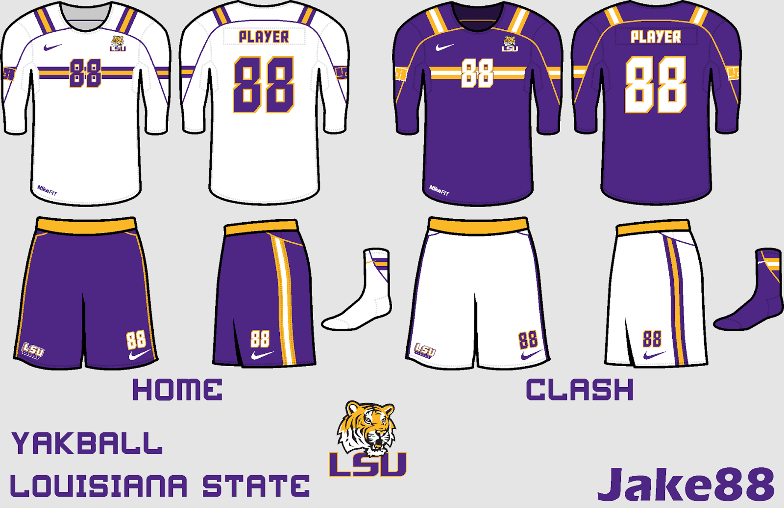
So I started a Yakball thread on Sportslogos.net and this was one of many suggestions of teams to do. For the jersey, I took inspiration from the schools football uniforms and put some striping on the top of the jersey. I also made a chest stripe that continues onto the arms.

Team Macedonia Yakball
This concept was made as a fix to Ricky's concept (Ricky was the old HJC writer and now will write on HCI). It's a bit different, but other than some logo controversy was quite liked on the Sportslogos.net forum.

Wagner Seahawks

Another suggestion from the forums, Wagner is a College on Long Island. Check out the unique nameplate! Yeah I care that much about the nameplate... Anyway I went classy for Wagner, while being new and different. 

________________________________________________________________________

Hockey Time!

Fishsticks Comp. Entry
This was my entry into HJC's Fishsticks comp. It features the four stripe design that stands for the four cup wins the Isles have, while also replicating the design on the logo. I kept a similar font to what they had on the originals.

Admirals Comp. Entry
This, like the one before, was an entry into an HJC comp. I think I came in 9th with 16 points in the voting. The blue jersey's striping is based on the logo, as the white jerseys  was my attempt of trying something different. 

Carolina Hurricanes 
 I was honored to have this concept up for CotW on HJC. Thanks to Jets96 and Jersey Fanatic for the nominations. The purpose of the concept was to use a "Nikeified" version of the Whalers colors. With this being up for CotW I think that everything that I wanted was achieved.

________________________________________________________________________

So how do do think I did with these? Tell me!

Bye! And comback soon!

Sunday, September 29, 2013

Celebrating the HCIHL Draft With Yakball

Hey guys, with the lightened posting schedule on HCI, requiring me to post every Tuesday and Friday, I can get back to my blog! We had our HCIHL draft yesterday night and I must say I think I did ok. Here is my Express' roster.
 It's in the order I picked the players, and you can see my little "D" panic where I picked 5 defensemen in a row! Only thing I am really missing is a good goalie. Wanted Bobrovsky, but the London Sabreswords, run by contributor Alan John Herbert, got him first. I am happy that I have Jussi Jokinen on my team. And let me tell you, getting Loui Eriksson in the 21st round was a steal! Should I go for some trades or is this good enough? Tell me!

U of South Carolina Gamecocks Yakball 
U of SC was my mom's school when she went to college (now she works at PSU) so I thought it would be cool to make a concept for them. These are heavily based on the schools football uniforms, but with some changes to make them unique. I might make a third based on the football thirds, and if I decide to, I will make an update with it in it.


Cross League Classic: Rochester Americans V.S. EC Düsseldorf
For my second Cross League Classic game I feature a DEL team V.S. Rochester. I think both jerseys are pretty self-explanatory myself, so I will let you judge how they look. 


Cross League Classic: Abbotsford Heat V.S. TPS Turku
The first game in my series is the Heat of Abbotsford playing TPS Turku of the SM-Liiga, newly named Liiga (National League). The Heat will play in Atlanta Flames style jerseys, the logo is the Atlanta Flames logo, the idea came from Justin. Also since Reebok keeps making squared off yokes, put that in the stitching pattern. The TPS jersey adds yoke striping and cuffs too their already classic jersey style. I think I did pretty good with it and am happy with how it turned out.

In other news, I went to the Color Run at Penn State today, and even though it took about an hour to get the color out, it was pretty fun! Ok, bye thanks for reading, and keep coming back!

Friday, September 27, 2013

Fantasy Starting!!!!

I can't wait!! The HCIHL is starting now!! The Express is ready for the draft on Saturday!! I can't tell you who I want for my picks but I am making a list. If you haven't seen our logos and jerseys take a look!

Primary
Alternate
Wordmark
Jerseys

Anyway can't wait to get started! Bye!

Monday, September 16, 2013

OH GOD I FORGOT!

Sorry for not posting on Wednesday or Friday, as the title suggests I forgot. Also 3 page views in one day is pretty sad. I hope this post as scranney as it is helps. Again I will give you guys some random concepts I have made recently with no explanation, also and always check HockeyConceptIdeas for my latest posts, in fact there is one from today. Happy reading!

Seattle Thunderbirds
Slovan Bratislava
Lokomotiv Yaroslavl
Neftekhimik Nizhnekamsk
Siber Novosibirsk

Like any of these? Tell me why! Dislike any of these? Tell me why! I always want to improve and if you can help do not hesitate!

Monday, September 9, 2013

More HCIHL and London

Hey, we have more HCIHL logo previews and and a guest concept from Alan John Herbert.


Here are the 2nd and 3rd pictures in the Springfield Sharpshooters logo unveiling.

London Knights (Alan John Herbert)
First things first, I personally like the lighter green and tan found on the alternate. I guess the home and away isn't that bad, and I like the choice of fonts. I do prefer their current set, but the alternate is really good. I also don't like the shade of gold used on the home and away. Concept Rating: 7/10

Thanks for reading and sorry for the late post. 

Saturday, September 7, 2013

HCIHL Update

Figured I'd post this here too, the HCIHL is giving their fourth team a week worth of unveiling pictures of their logos and jerseys. I will update these posts on Monday, Wednesday and on the big unveiling on Friday. Also you can follow the pictures on HCIHere's the first image. 


Also this the Tenth post in Jake88JC history.

Saturday, August 31, 2013

Some Concepts

Hey guys, I'm sorry that I haven't posted for 11 days, so here's one. Also if you want to see more of my posts check HCI. For this post I won't comment on them so any criticism in the comments is helpful.

Severstal Cherepovets
Montana State Bobcats
Mississippi Surge
Since the name of the blog is Jake88JerseyConcepts (no mention of hockey anywhere) I made these and now they are on the blog.
Team Finland Yakball

Penn State Yakball

So if you don't like any of these, just tell me. If I like your suggestion maybe I will use it. 
Thanks for reading, and I hope the rest of the day is good for all of you, bye!

Tuesday, August 20, 2013

Next Wave is not a Fav

For the people who have yet to see San Jose's new jerseys I have the good's right here.
From Sportslogos.net
I am not a fan of these, the Sharks had one of the best looks in the NHL, all they had to do is get rid of the front number and add the fin as a shoulder patch; but instead we get this. So far the Sharks, Canes, Remparts (QJMHL), have all had bad jersey designs, as the Stars got IMO the best look in the NHL, and the Providence Bruins (AHL) dropped the white for a good look. Speaking of a new look, the Sabres 3rd jersey is probably going to suck too. 

San Jose Sharks
This is how I think that San Jose should have made the "minor changes". The changes I made were the name plate yoke, on the Stars template which is my favorite template. The striping stays the same and so do the numbers. The new alternate is inspired by the pre-edge alt. with the bent arm stripes. I added a hem stripe to complete the jersey, something the new jerseys need. Sometimes I think that Reebok can make the best looks and San Jose was one of the things that cemented that for me, now the trust in Reebok is going away.

Buffalo Destroyers (AFL) By Ricky from BNG

Can I just say how out there this concept is. I really can't say much after that. There's just too much going on for me to like it. The one thing that I do want to say is that I would flip the the vertical sock striping. The color balancing looks good though.The concept over all is way too cluttered. Concept Rating 6/10

New York Dragons (AFL) By Ricky from BNG
I mentioned earlier in this post that I love the new Stars template, but this is a different way to use it. I might add hem stripes, but side panels don't really look that bad. I love the yoke striping and the neckline similar to the old LA Kings Alt. and the recently unveiled Providence Bruins Alternate jersey. Speaking of the Alt I can't say I really like it. The use of the two shades of green like in the logo looks bad. On the other hand I really like the number font in the comments can you tell me? Concept Rating 8/10

In other news I won Concept Of The Week (COTW) on HJC, thanks to everyone who voted. And my Alaska Aces concept won the ECHL contest on HCI. 

Bye, and thank you all for reading!

Friday, August 16, 2013

SKA Day!

Recently I have gotten into making fonts for the blog (check those out in the Templates page) and have stopped making a lot of concepts. Expect less and less posts as school is coming soon, and my practices are becoming more frequent. For now I have 2 concepts of my own and one by Alan John Herbert.

SKA St. Petersburg
For the first of the two "SKA" concepts today I have SKA St. Petersburg. I tried to make it resemble the New York Rangers-like jerseys they have now, with their own style. I included a star on the cuffs and in the numbers.

CSKA Moskva
For the Red Army I figured that something like this would work, classic, but with some different elements than their currents, yet still the same. I brought the old logo back, I think that the current logo despite classic is quite boring,  and this logo works for them. The chest stripe is from the 08-09 jersey, and the red pants although odd are what they wear now and they look good.

Plymouth Whalers By Alan John Herbert
This concept was on HJC Wednesday, HCI Thursday, and Jake88JC Friday. I like the the edited Ducks font, but I have never liked the grey in the original Whalers color scheme, and it doesn't look good here, I would keep the green, white, and blue colors they have now. I like the wave striping, but again the grey is really holding this back. Concept Rating 7/10

As always thanks for reading!  

Tuesday, August 13, 2013

Three Concepts; None by Me

For today's post I didn't even have to make one concept! That explains it all. Except for a few more things, I have accepted to be an assistant writer on a new blog called HockeyConceptIdeas where some of my concepts will be featured. My Admin. even has a concept today. In the About page we now have a twitter (I'm too lazy to put another link). And follow the European Trophy. Now to the concepts.

Colorado Avalanche By Ricky from BNG
 Ricky says that the logos used where all from college teams, the primary is from The Univ. of Hawai'i, the second secondary from Siena, and the third from UTEP. The home and away template is a rare one to use, and one of my favorite Reebok cookie cutter templates. In my opinion the home jersey is almost perfect I would just make the name/number font white. I would (on the white) get rid of the grey and add black, sometimes I feel that I am the only one who likes black on the Avs. For the third I would go with the UTEP logo instead of the Siena logo, the jersey is a unique design which works because of the design of the other jerseys. My rating on the collegiate Avalanche is a clean 8.5/10

Buffalo Bandits By Ricky from BNG
Rickys Buffalo Bandits lacrosse to hockey jersey looks really good to me, execpt for one thing. That being the purple in the striping on the home an away. To me it would look much better all black. The third looks nice too, all except for the over sized logo but, I'm sure that's intensional. the numbers on the front of the jersey are a nice touch, since they were first on the Buffa-Slug jerseys. 8/10

St. Louis Blues By Caden
If you read my advice to Caden on Friday (on HCI), you can see he took it and made this. I like the idea of a yellow jersey for the Blues, but only as a alternate (if that were to happen they could build a home and away off their AMAZING alt., IDEA!!!!!). The problems I have with this set are mostly execution errors, such as, the T.V. numbers on the yellow jersey cutting into the piping, the Reebok logo on the back instead of the script, the AHL tag instead of the NHL (and the NHL shield isn't on the collar insert), and the blue behind the collar on the yellow jersey. But those are minor. My real problems with the set are the Number font (I would use a block font) the white numbers on the yellow jersey (BLUE), and the weird colored cuffs (just make them yellow). Other than that this reminds me of myself, when I began to make concepts,  thats good, I think. Concept Rating 8/10.

Thanks for reading.   

Wednesday, August 7, 2013

Extra Jerseys One

If you have noticed on HJC I always include one "extra jersey" between series. Here are some of my newer ones. Along with one jersey by Ricky from BNG.

Alaska Aces Third Jersey
For the only ECHL team in Alaska I did a modern jersey, as that is defiantly what they should have, especially with their logos, which are one of, if not the best sports logos in use. As you can see I tried to use those in the jersey, which use the swoops and angle style similar to the logo. For the fonts I used the Winnipeg Jets fonts, and along with the fonts the Name On Back (NOB) is for Sean Curry.

Wilkes-Barrie Scranton Penguins Third
The Baby Pens need a third jersey, and I think I provided a pretty good one, myself. There are two obvious striping inspirations, the first being that in the logo, that striping pattern exists. The second is that they are the Pittsburgh's farm team and it works even more since the "big club" uses navy versions of these. NOB is for Anton Zlobin.

Dallas Stars "Revenge of the Wordmark" Fan Jersey
Remember those horrid uniforms that Dallas donned before the imo best jerseys in the NHL... Well now they are back, just this time in a GOOD color scheme. I just hope that Dallas never uses any version of this as I made this as a FAN JERSEY ONLY. I probably won't sent this to HockeyJerseyConcepts.com but if I get enough feedback on it I will. So if you like it tell me in the comments.

Hawai'ian Ducks Fan Jersey By Ricky from BNG
For the second concept ever sent in to Jake88JerseyCocnepts Ricky gives us an Anaheim Ducks fan/special event jersey with a Hawai'ian style pattern. I like the idea but would change two things. First and the problem I noticed first, is that I would switch the black and white areas in the font, therefore a white font with a black and orange outline. The other is a personal dislike of the duck mask shoulder patch. This shirt (almost literally) gets a 8/10 

This is the end of the first extra jerseys post. I will do these Extra jersey posts every five posts. Thanks for reading, and have a great rest of your day, bye!

Monday, August 5, 2013

3 More and a Concept for a Contest

In today's post three more KHL jerseys will appear and one special jersey also by me. 

Atlant Mytishchi 
For Atlant who just updated their logo (you hear that Sportslogos.net?) I gave them a Nashville-esque look. Except with a blue jersey too. I used piping as a way to balance the colors, and semi-modern numbers. NOB is for last years SM-Liiga scoring leader Juha-Pekka Haataja.

Spartak Moscow
Although the red jersey may just be pretty much a Red Wings jersey with a yoke stripe and a tie-down collar, I tried to make the white jersey different. So a yoke cuffs and phantom stripes (that is what I am calling them, like a phantom yoke right?) were made and the phantom stripes are what I like most. NOB is for Jeff Glass

Dinamo Minsk
This is one of my more recent concepts, and it uses Dallas's new template, which I love (the template and the jerseys in general). These jerseys, if you notice, aren't that original, as they are direct recolors of Dallas's jerseys, (yes even the striping) but they still look good to me. NOB is for Lars Haugen. 

Warrior Cup Challenge Jerseys
For HJC's Warrior Cup Challenge competition I made this. I really can't say much for this one other than it's made on the Capitals old template with added yoke stripes and a star on the cuff. The CCM sock template was made by me and will be available in my templates page soon along with a CCM jersey to match. NOB is for the great USA, and the 76, if you don't know, is for 1776 the year USA declared independence from Britain. Give me your opinion on these jerseys in the comments as I haven't sent it in yet. 

USA! USA! USA! Bye and have a good rest of your day!   

Saturday, August 3, 2013

First Concept Sent In!

As you can see from the title someone has sent me one of their concepts. It surprised me to see that the concept sent in was from one of my favorite concept artists, Alan John Herbert. I thank him for doing this as I can finally grade someone else's concepts. Here is Alan's blog. His concept will be last in this post.

AK Bars Kazan

For the "Snow Leopards of Tatarstan" I used Atlanta's modern third template along with their classic logo. Although those don't seem to mix, that's what Kazan has done with their jerseys. You can check them out here. As for the classic logo, the logo is actually the coast of arms, of Tatarstan, you can read about Tatarstan here. NOB is for former Thrasher and Jet, Alexander Burmistrov.   

Admiral Vladivostok 

This was the first jersey I made for the KHL redesign, except I didn't even know that I was going to do the KHL as a series when I made it. The striping is meant to be reminiscent of the logo but of course not exact. NOB is for Niclas Bergfors.

Metallurg Magnitogorsk
Of the two Metallurgs in the KHL this is one I did first. Their current jersey can be found here. As you can see their is no longer any grey in the color scheme and the logos where switched for home to away and away to home, I think it helps visibility. The pattern of the stripes came to me in a vision (after seeing Grown Ups 2, oddly) but I like it. NOB is for Jan Kovar.

 Kitchener Rangers by Alan John Herbert
Like it says on the concept Alan tries to make the Rangers of Kitchener less New York and his switch works perfectly. I only have two critiques. Number 1, put the logo you made on the pants (hey it's a good logo, not good enough to be a primary but still a good secondary). Number 2, why make the white jersey's helmet red when you can make it white? I realize that most CHL team use the same helmet for the home and road games, but if they could get a different color helmet I would make it white. Still a good design overall, 8.5/10.

Well that concludes the third post in Jake88JerseyConcepts history. It's a nice day and I now want to go outside, bye and have a good day!